Music
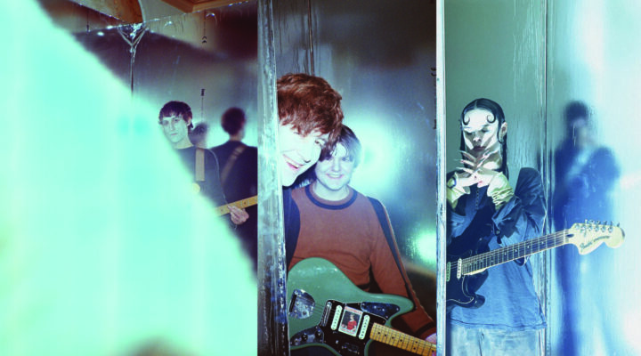
Crate Digging With Amen Dunes
Having released the outstanding full-length affair Love earlier this year, Damon McMahon seems to have come out of this experience a different man, a careful and thoughtful man. It’s no wonder that he revealed his meticulously worked out lyrics from the LP to be as important as the sound of the album. Because “nothing is worse than when a band’s lyrics waste space, and nothing better than when a band’s lyrics surprise you and turn a song on its head.” Same goes for the visual identity of a record, the aesthetics of the cover art should not play second fiddle to the sound. Read on about the good, the bad and the ugly of album art, and that Love nip slip that has kept you guessing
Interview by Andreea Breazu, photos shot by Cait Oppermann and Christopher Schreck in New York, USA
What album have you judged by its cover?
The first thing that comes to mind is Big Star – Sister Lovers. Its my favourite album of all time, but it has the most insanely boring cover art. Kind of amplified its quality though, since it felt like the music was hidden behind the album art.
Which album’s art makes you weep?
Well, one of my favourite albums of all time is Tim Buckley’s Happy Sad. I have always felt that the music on that album is profoundly heavy…and the cover photo represented it perfectly. Beautifully accurate moment of melancholy in that photo. So maybe that’s the closest to weeping. But I’ll say the first thing that came to mind was Dead C’s Trapdoor Fucking Exit. I got that in like ’98 or so. The art was so good it could have sounded like anything, but it made it obvious that they were doing some serious shit. The plain text on the cover, and the black and white image on the back (which I ripped off for our latest tour shirt) felt totally modern and urban and ambiguous. It wasn’t clearly like a rock album cover art or anything, which is kind of a move that inspired all the Amen Dunes aesthetics, never having the art telegraph exactly how the music sounds or a genre.
Which album is most at odds with its cover art?
Happy Mondays’ Bummed, I wouldn’t say it’s necessarily at odds with the music, but it has a sentiment to it that you wouldn’t associate with a superficial understanding of their music. The cover image is kind of forlorn, pensive and clearly a smart choice. It’s a great example of the complexity of that band’s music. An approach that also inspired me with Amen Dunes or more accurately an approach I just felt a kinship with. Many bands are two-fold, we sound like THIS and our aesthetics are like THIS. I’ve always liked bands that are diverse in their sound and aesthetics. That’s super important to me. And Happy Mondays are totally that. They’re street drug party music, yes, but their lyrics are also super poetic and grotesque, as well as actually really thoughtful and unexpected. Basically they are the shit.
What album do you like despite its artwork?
Beard of Bees by This Kind of Punishment. That album art sucks unfortunately, ha, but the album is so smart and amazing. One of my favourite albums, also a project I feel a real kinship with.
What album from your collection would you hang on your wall?
I’ve got a Leon Thomas record on my wall at the moment not because the art is that good but because his vibe points me in the right direction.
What album would make it in your bookshelf?
Well, its rare I think for album lyrics to be that good, or good enough to warrant printing as a book, but you know Dylan’s lyrics in the 60s post Freewheelin’ and pre Nashville Skyline were incredible. Trout Mask Replica is always worth reading too. Bought that when I was 14 and smoking a lot of pot. That shit on the headphones while reading the lyrics taught me a lot. Would never have done Spoiler without that experience.
What’s the most striking concept album you’ve listened to?
First thing that comes to mind is Lou Reed’s Berlin. One of the most beautifully nasty and scary records. So gross and amazing. Shit I love that album, just writing about it…and it’s a perfect circle from top to bottom. But then also Dark Side of the Moon. I couldn’t tell you what it’s about, ha, kind of silly and unimportant, but it’s an insanely perfect and amazing album, and works as a whole in a perfect way.
Finally, what’s the story of the girl on the cover of Love?
Tuomas Korpijaakko has been my only partner ever when it comes to the AD art. For the first two albums I made the art and he laid it out, but since then he’s done everything. Obviously we both come up with the ideas, but he really steers the ship. So we were trying a million things for Love and nothing was working. But there was this photo of his girlfriend on his wall I always loved. He kept saying naw that’s too obvious, but eventually we tried it and it just worked perfectly. It’s simply beautiful but also complicates the theme with her movement and the energy of the photograph. And its further complicated by the photo in the insert of the car headlights.
Amen Dunes plays Haperende Mens at Melkweg, Amsterdam on 12 September. The show is free for Subbacultcha! members. More info here.
Related